


Design Process for an Issue Summit Conference
1. Incorporating the Environment
I began by assessing the unique characteristics of the industrial venue, with its exposed brick, concrete, and heavy black tones. The space had a raw, modern feel, which inspired me to challenge the organization's current corporate brand guidelines. My goal was to create a design that harmonized with the venue while elevating the brand's visual identity to make an impactful statement.
2. Challenging the Brand Guidelines
Rather than adhering strictly to the existing brand standards, I aimed to explore how these guidelines could be expanded or adapted to better suit the industrial setting and the creative aspirations of the event. This required a balance between respecting the brand’s established identity and embracing a more innovative, venue-specific approach.
3. Developing Conceptual Directions
I presented three distinct concepts to the CEO and Executives to align on the visual direction:
Concept 1: The Safe and Corporate Approach
This design strictly adhered to the current brand guidelines, offering a polished and professional look that maintained the familiar elements of the organization’s identity.Concept 2: Stakeholder-Inspired Design
This concept reflected input gathered from brainstorming sessions with stakeholders and Executives. It represented a collaborative vision, integrating narrowed-down ideas while introducing subtle creative twists.Concept 3: The Wild Card
My boldest proposal, this concept pushed the boundaries of the brand. It incorporated the raw textures and dramatic tones of the industrial space, blending them with modern and edgy elements. While it retained some familiarity with the brand guidelines, it embraced innovation through unique textures, an expanded color palette, and contemporary design elements.
4. Stakeholder Engagement and Feedback
I facilitated discussions around the concepts, gathering feedback and refining the designs to address both stakeholder preferences and the practical considerations of the event. This collaborative step ensured that the chosen design resonated with the audience and the event's purpose.
5. Final Design Execution
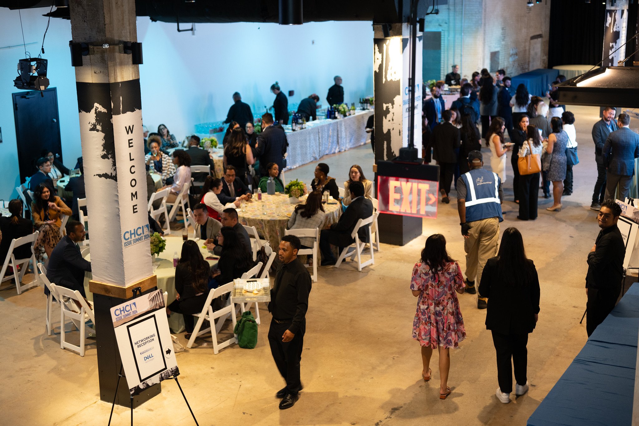
Once the "wild card" concept was selected, I developed a cohesive suite of materials, including event signage, stage design, digital assets, and print collateral. Each element was tailored to reflect the industrial space’s aesthetic while maintaining brand integrity. The design emphasized contrast, modern typography, and strategic use of color to create a sophisticated and immersive experience for attendees.
6. Post-Event Reflection
After the event, I conducted a review to assess the effectiveness of the design in achieving its goals. Feedback from stakeholders and attendees indicated that the design resonated strongly with the audience, successfully marrying the industrial setting with a refreshed take on the organization’s brand.
This process demonstrated the value of pushing creative boundaries while remaining grounded in collaboration and brand identity.
Design Process: Bringing Concept 3 to Life
I began by anchoring the design with a custom fabric print. This print served as the foundation for the entire visual identity of the event, symbolizing land, foundation, and strength. Inspired by the industrial space, the print subtly mirrored the textures of the venue (brick, concrete, and exposed walls)—while incorporating abstract shapes to evoke stability and resilience.
Color Palette
The color palette was carefully curated to complement both the venue and the organization's brand identity. Heavy black was chosen to harmonize with the building's window trim and industrial aesthetic, grounding the design with a sense of weight and sophistication. Earth tones—rich browns, muted greens, and sandy neutrals—were integrated to reflect the natural elements and provide warmth. To inject vibrancy and tie back to the brand’s colors, I introduced a bright blue, which acted as a focal point, awakening the space and drawing attention to key elements of the design.
Application of the Design
The fabric print became a unifying element, featured in:
Stage Backdrops: Panels covered in the printed fabric added texture and dimension, creating a strong visual impact that echoed the event’s themes.
Signage and Wayfinding: Incorporating the print as accents on directional signage and informational boards brought cohesiveness across all materials.
Branded Elements: Custom tablecloths, lanyards, and attendee badges utilized the fabric design to tie every detail back to the overarching theme.
Balancing Boldness and Brand Familiarity
While the concept pushed boundaries with its modern aesthetic and innovative use of textures, it still maintained a connection to the organization's identity through strategic use of brand colors and thoughtful design choices. The interplay of grounded tones with vibrant blue created a dynamic, sophisticated visual language that resonated with the space and the audience.
This approach demonstrated how intentional design can bridge the gap between an organization’s existing identity and a bold, venue-specific creative vision, ultimately creating an immersive and memorable experience.